What is Web Design?
Web design is the process of creating visually appealing and functional websites. It encompasses a variety of elements, including layout, colors, typography, graphics, and user experience. A well-designed website can help businesses to establish a strong online presence and engage with their target audience effectively.
The Importance of Web Design
In today’s digital age, having a website is crucial for any business. A website serves as a virtual storefront and can help businesses to reach out to potential customers from all over the world. However, simply having a website is not enough. The website must be well-designed in order to attract and retain visitors.
A poorly designed website can have a negative impact on a business. Visitors may find it difficult to navigate, which can lead to frustration and result in them leaving the site. A poorly designed website can also make a business appear unprofessional, which can damage its reputation.
On the other hand, a well-designed website can have a positive impact on a business. A well-designed website can help to establish a strong brand identity and increase brand recognition. It can also help to increase customer engagement and encourage visitors to take action, such as making a purchase or filling out a contact form.

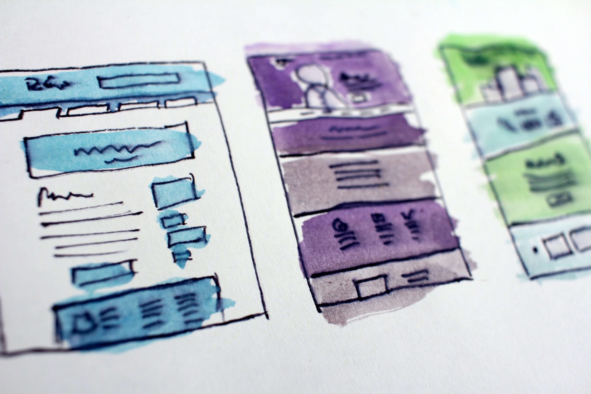
Elements of Web Design
There are several elements of web design that must be taken into consideration in order to create a successful website. These include:
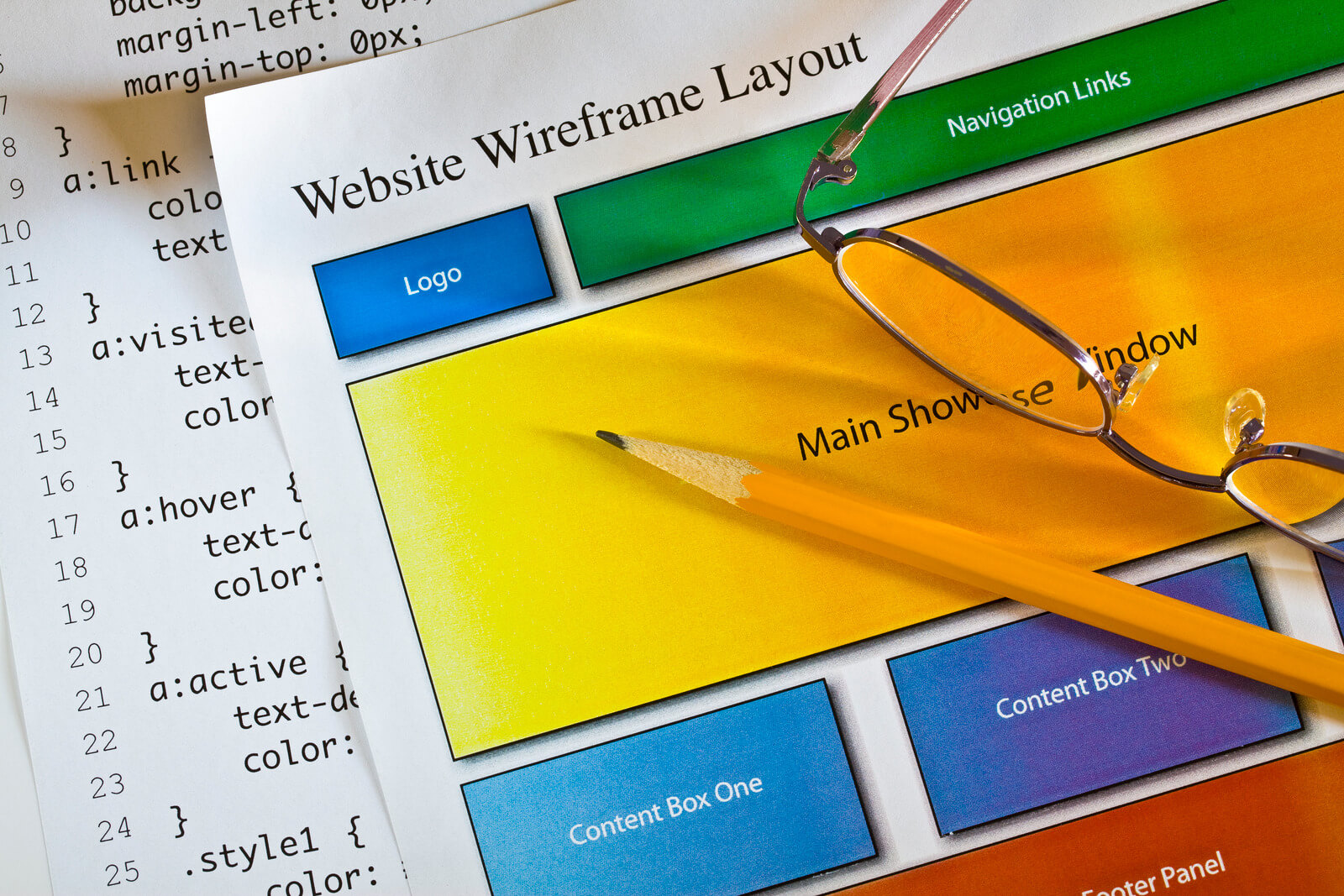
- Layout – The layout of a website refers to the arrangement of its elements, such as images, text, and navigation menus. A well-designed layout should be easy to navigate and visually appealing.
- Colors – The colors used in a website can have a significant impact on its overall look and feel. Colors can be used to establish a brand identity and create a mood or emotion.
- Typography – The typography used in a website refers to the style and appearance of the text. Typography can help to establish a hierarchy of information and guide visitors through the site.
- Graphics – Graphics, such as images and icons, can be used to enhance the visual appeal of a website and communicate information to visitors.
- User Experience – User experience (UX) refers to the overall experience that visitors have when using a website. A well-designed UX should be intuitive and easy to use, with clear navigation and minimal distractions.
Web Design Best Practices
Web design best practices are a set of guidelines that help ensure that websites are effective, user-friendly, and accessible to all users. To create a successful website, it’s important to consider factors such as user experience, performance, accessibility, and search engine optimization.
One of the key best practices is to understand your audience. Before designing a website, it’s important to research and understand the target audience. This can involve creating user personas, conducting surveys, or analyzing website analytics data. By understanding the audience, designers can make informed decisions about the site’s layout, content, and functionality.
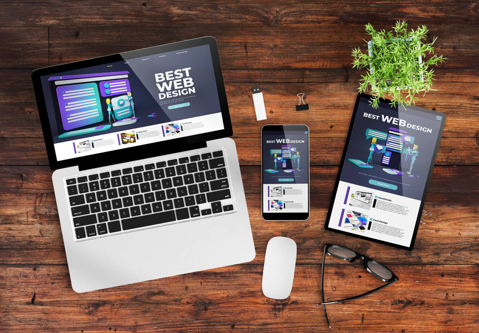
Responsive Design
Responsive web design is an approach to building websites that allows them to adapt to different screen sizes and devices. In order to create an effective responsive website, there are several best practices that you should follow. Here are some key guidelines:
- Use a mobile-first approach: Start by designing your website for the smallest screen size first and then work your way up to larger screens. This ensures that your site will look good on mobile devices, which is important given the increasing number of people using mobile devices to access the internet.
- Prioritize content: Make sure that your website’s content is easily accessible and readable on all screen sizes. This means using appropriate font sizes, spacing, and formatting. It’s also important to consider the order in which content appears on different devices, as some content may need to be moved or reorganized to fit smaller screens.
- Use a responsive grid system: A grid system helps you organize your content and layout in a consistent and flexible way. A responsive grid system adjusts the layout based on the screen size, allowing your content to be displayed in the most effective way possible.
- Optimize images: Large images can slow down your website and make it difficult to load on mobile devices. To ensure fast loading times, optimize your images by compressing them and reducing their file size. You can also use responsive images, which adjust their size based on the screen size.
- Test on multiple devices: Make sure to test your website on multiple devices, including smartphones, tablets, laptops, and desktops. This will help you identify any issues with the layout or functionality of your site and make necessary adjustments.
- Use responsive design frameworks: There are many responsive design frameworks available that can help you build a responsive website quickly and efficiently. Some popular frameworks include Bootstrap, Foundation, and Materialize.
By following these best practices, you can create a responsive website that looks great on any device and provides a seamless user experience.
Fast Loading Times
Fast loading times are critical for ensuring that a website provides a good user experience. Slow-loading websites can frustrate users and lead to high bounce rates. Here are some best practices for improving website loading times:
- Optimize images: Images are often a major factor in slow-loading websites. To improve loading times, it’s important to optimize images by compressing them and reducing their file size. This can be done using tools such as Adobe Photoshop or online tools such as TinyPNG.
- Minify code: Large and complex code can also slow down website loading times. To improve performance, designers should minify the website’s code by removing unnecessary spaces, comments, and other non-essential elements. This can be done using tools such as CSSNano or UglifyJS.
- Use caching: Caching involves storing frequently accessed data and files so that they can be quickly retrieved when needed. By using caching techniques such as browser caching and server-side caching, websites can improve loading times and reduce server load.
- Reduce HTTP requests: Every time a website loads, it sends requests to the server for different files, such as images, scripts, and stylesheets. To improve loading times, designers should aim to reduce the number of HTTP requests by combining files, using CSS sprites, and avoiding unnecessary scripts.
- Use a content delivery network (CDN): CDNs are networks of servers located around the world that store copies of website files. By using a CDN, websites can reduce the distance that data needs to travel, which can improve loading times.
- Optimize hosting: Finally, website hosting can also affect loading times. By choosing a reputable and reliable hosting provider and using a plan that is suitable for the website’s needs, designers can improve loading times and reduce server downtime.
Fast loading times are critical for ensuring a good user experience. By optimizing images, minifying code, using caching, reducing HTTP requests, using a CDN, and optimizing hosting, designers can improve loading times and create websites that are fast, responsive, and user-friendly.

Clear Navigation
Clear navigation is an essential element of a successful website. Navigation should be intuitive, easy to use, and help visitors quickly find the information they are looking for. Here are some best practices for creating clear navigation:
- Keep it simple: Navigation should be simple and straightforward. Avoid using too many links or overwhelming visitors with too many options. Use a simple and clear navigation menu that clearly outlines the site’s main sections and pages.
- Use clear labels: Navigation labels should be clear and easy to understand. Use descriptive and concise labels that accurately describe the page or section of the website. Avoid using vague or generic labels such as “Products” or “Services” and instead use more specific labels that clearly convey what visitors can expect to find.
- Use hierarchy: Use a clear hierarchy to organize navigation links. Place the most important and frequently accessed pages at the top of the menu and group related pages together. This can help visitors quickly find the information they are looking for and improve the overall user experience.
- Use breadcrumbs: Breadcrumbs are a secondary navigation tool that help visitors understand where they are on the website and how to get back to previous pages. Use breadcrumbs to show the user’s location in the site’s hierarchy and make it easy to navigate back to previous pages.
- Use visual cues: Use visual cues such as color, typography, or icons to help visitors quickly identify different sections of the website. This can make it easier to scan the navigation menu and quickly find the desired information.
- Test and refine: Finally, it’s important to test the navigation and refine it over time. Use analytics tools to track user behavior and identify areas where visitors are getting stuck or leaving the site. Make changes and improvements to the navigation based on user feedback and behavior to improve the overall user experience.
Clear navigation is essential for creating a user-friendly website. By keeping it simple, using clear labels, using hierarchy, using breadcrumbs, using visual cues, and testing and refining, designers can create navigation that is easy to use and helps visitors quickly find the information they need.
Consistent Branding
Consistent branding is an important aspect of web design. A consistent brand helps build trust and credibility with visitors, and makes it easier to establish a clear message and visual identity. Here are some best practices for maintaining consistent branding in web design:
- Use brand colors: Use the brand’s primary colors throughout the website to reinforce the brand’s visual identity. Use the same color scheme in all marketing materials, and avoid using colors that are not part of the brand’s color palette. This helps create a consistent look and feel across all web pages.
- Use consistent typography: Use the same font family and font size throughout the website to maintain a consistent visual identity. Use typography that is consistent with the brand’s values and personality, and avoid using fonts that are not part of the brand’s typography.
- Use consistent imagery: Use imagery that is consistent with the brand’s values and visual identity. This includes using images that reflect the brand’s color scheme, tone, and messaging. Consistent imagery helps create a cohesive look and feel across all web pages.
- Use the same logo: Use the same logo throughout the website to establish a consistent visual identity. Make sure the logo is displayed prominently on the website, and use it consistently in all marketing materials.
- Use consistent messaging: Use messaging that is consistent with the brand’s values and personality. This includes using the same brand voice and tone throughout the website, and avoiding messaging that is not consistent with the brand’s values.
- Maintain consistency across all pages: Ensure that all pages on the website follow the same design principles and visual identity. This includes using the same layout, font, color scheme, and imagery throughout the website.
Consistent branding is an important aspect of web design. By using brand colors, consistent typography, imagery, messaging, logos, and maintaining consistency across all pages, designers can create a consistent and cohesive brand identity that helps build trust and credibility with visitors.

Accessibility
Web accessibility is an important aspect of web design that ensures that all users, including those with disabilities, can access and use the website. Here are some best practices for designing an accessible website:
- Use appropriate markup: Use appropriate HTML markup to ensure that the website is accessible to users with screen readers and other assistive technologies. This includes using appropriate headings, lists, and other markup to make the content more accessible.
- Provide alt text for images: Use alt text for images to ensure that users with visual impairments can understand the content of the images. Alt text should be descriptive and provide information about the content of the image.
- Use color contrast: Use appropriate color contrast to ensure that users with visual impairments can read the content on the website. This includes using a color contrast ratio of at least 4.5:1 for text and images.
- Use accessible forms: Use accessible forms to ensure that users with disabilities can fill out forms on the website. This includes using labels and instructions that are clearly visible and easy to understand.
- Provide keyboard navigation: Ensure that users can navigate the website using a keyboard. This includes ensuring that all interactive elements, such as links and buttons, can be accessed using the keyboard.
- Use descriptive link text: Use descriptive link text to ensure that users can understand the content of the link without having to click on it. This includes using descriptive text instead of generic phrases such as “click here”.
- Provide captions and transcripts: Provide captions and transcripts for videos and other multimedia content to ensure that users with hearing impairments can access the content.
- Test and refine: Finally, it’s important to test the website for accessibility and refine it over time. Use accessibility testing tools and user feedback to identify areas where the website can be improved to better serve users with disabilities.
Designing an accessible website is an important aspect of web design. By using appropriate markup, providing alt text for images, using color contrast, accessible forms, providing keyboard navigation, descriptive link text, captions and transcripts, and testing and refining the website for accessibility, designers can create a website that is accessible to all users, including those with disabilities.

Conclusion
Web design is a critical component of building a successful online presence for businesses. A well-designed website can help to establish a strong brand identity, increase customer engagement, and drive business growth. By following best practices and paying attention to elements such as layout, colors, typography, graphics, and user experience, businesses can create websites that attract and retain visitors, and ultimately, achieve their online goals.